How to decide on Your Data Visualization Graphs
7 Essential Questions You Need To Ask Before Deciding On Your Data Visualization Graphs
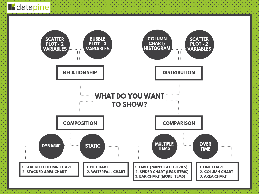
As mentioned, asking the right questions will form the foundations of choosing the right types of visualization charts for your project, strategy, or business goals. The fundamental categories that differentiate these questions are based on:
- Relationship
- Distribution
- Composition
- Comparison of data
To get a clearer impression, here is a visual overview of which chart to select based on what kind of data you need to show:
**click to enlarge**
To go further into detail, we have selected the top 7 questions you need to consider to ensure success from the very start of your journey.
1. What story do you want to tell?
At its core, online data visualization is about taking data and transforming it into actionable insight by using it to tell a story. Data-driven storytelling is a powerful force as it takes stats and metrics and puts them into context through a narrative that everyone inside or outside of the organization can understand.
By asking yourself what kind of story you want to tell with your data and what message you want to convey to your audience, you’ll be able to choose the right data visualization types for your project or initiative. And ultimately, you’re likely to enjoy the results you’re aiming for.
For more on data storytelling, check out our full guide for dashboard presentation and storytelling.
2. Who do you want to tell it to?
Another key element of choosing the right data visualization types is gaining a clear understanding of who you want to tell your story to – or in other words, asking yourself the question, “Who is my audience?”
You may be aiming your data visualization efforts at a particular team within your organization, or you may be trying to communicate a set of trends or predictive insights to a selection of corporate investors. Take the time to research your audience, and you’ll be able to make a more informed decision on which data visualization chart types will make the most tangible connection with the people you’ll be presenting your findings to.
3. Are you looking to analyze particular trends?
Every data visualization project or initiative is slightly different, which means that different data visualization chart types will suit varying goals, aims, or topics.
After gaining a greater level of insight into your audience as well as the type of story you want to tell, you should decide whether you’re looking to communicate a particular trend relating to a particular data set, over a predetermined time period. What will work best?
- Line charts
- Column charts
- Area charts
4. Do you want to demonstrate the composition of your data?
If your primary aim is to showcase the composition of your data – in other words, show how individual segments of data make up the whole of something – choosing the right types of data visualizations is crucial in preventing your message from becoming lost or diluted.
In these cases, the most effective visualizations include:
- Pie charts
- Waterfall charts
- Stacked charts
- Map-based graphs (if your information is geographical)
5. Do you want to compare two or more sets of values?
While most types of data visualizations will allow you to compare two or more trends or data sets, there are certain graphs or charts that will make your message all the more powerful.
If your main goal is to show a direct comparison between two or more sets of information, the best choice would be:
- Bubble charts
- Spider charts
- Bar charts
- Columned visualizations
- Scatter plots
Data visualization is based on painting a picture with your data rather than leaving it sitting static in a spreadsheet or table. Technically, any way you choose to do this counts, but as outlined here, there are some charts that are way better at telling a specific story.
6. Is timeline a factor?
By understanding whether the data you’re looking to extract value from is time-based or time-sensitive, you’ll be able to select a graph or chart that will provide you with an instant overview of figures or comparative trends over a specific period.
In these instances, incredibly effective due to their logical, data-centric designs, functionality and features are:
- Dynamic line charts
- Bar graphs
7. How do you want to show your KPIs?
It’s important to ask yourself how you want to showcase your key performance indicators as not only will this dictate the success of your analytical activities but it will also determine how clear your visualizations or data-driven stories resonate with your audience.
Consider what information you’re looking to gain from specific KPIs within your campaigns or activities and how they will resonate with those that you’ll be sharing the information with – if necessary, experiment with different formats until you find the graphs or charts that fit your goals exactly.
Here are two simple bonus questions to help make your data visualization types even more successful:
- Are you comparing data or demonstrating a relationship?
- Would you like to demonstrate a trend?
At datapine, data visualization is our forte. We know what it takes to make a good dashboard – and this means crafting a visually compelling and coherent story.
“Visualization gives you answers to questions you didn’t know you had.” – Ben Shneiderman

Comments
Post a Comment